- Template item
Let’s start with the obvious: most ecommerce sites aren’t conversion-optimized. Not really.
Sure, there’s a clean homepage. Maybe even a few A/B tests running in the background. But actual conversion strategy—the kind that ties customer behavior to ecommerce business goals—that’s missing from a lot of brands doing seven figures and up.
The real problem? You don’t need more traffic. You need to stop wasting the traffic you already have. And that's what ecommerce conversion optimization is all about.
What is ecommerce conversion optimization?
Ecommerce conversion optimization—or ecommerce CRO—is the practice of improving the percentage of website visitors who take a desired action. That action could be a purchase, sure. But it could also be smaller, upstream steps: adding to cart, signing up for a product waitlist, or clicking through a product recommendation.
Put simply: it’s about making your store better at selling to the people already on your site.
The method? You identify where people are dropping off. You form a hypothesis. You test a change. You look at the data. And you keep going. It’s iterative. It’s not glamorous. But it’s necessary to facilitate sustainable growth.
Why is ecommerce CRO important?
Because traffic doesn’t mean revenue.
You can have 100,000 monthly visitors and still lose money if your online store can’t close. Ecommerce CRO is what makes sure you’re not leaking potential revenue at every step of the funnel.
In this context, a “conversion” could be:
- Clicking on a product image
- Adding an item to the cart
- Completing a checkout
- Redeeming an offer
- Accepting a cross-sell or upsell
- Signing up for a back-in-stock alert
Every one of those is a micro-conversion that ladders up to a sale. And every one of them can be optimized.
What’s tricky is that every audience, every product, and every funnel behaves a little differently. That’s why there’s no universal fix—and why a good CRO strategy is built on hard data.
The goal here is to drive meaningful business impact: more revenue per session, higher average order value, stronger customer retention. Better ROI from the same—or even smaller—ad spend.
Read More: 12 Essential Skills for Expert Growth Marketing Managers
20 ecommerce conversion rate optimization strategies
1. Optimize page load speed
Shaving even fractions of a second off load time can boost sales. Back in the day, Amazon found that each 100ms of extra load time cost ~1% in revenue. The faster your site, the less chance visitors bounce out of frustration. For example, Walmart saw conversion rates climb ~2% for every 1 second of speed improvement.
So, compress image sizes. Use caching. Minify code. And audit third-party scripts.
2. Embrace mobile-first design
Too many brands build for desktop, then squish everything into a mobile frame and hope for the best. This results in tiny buttons, slow loads, clunky forms, and drop-offs during checkout.
Make the mobile device your starting point. Design with thumbs in mind. Reduce friction at every step—from navigation to checkout. Because if 60% of your site visitors are on mobile and not buying, you don’t have a traffic problem. You have a conversion one.

3. Simplify ecommerce website navigation
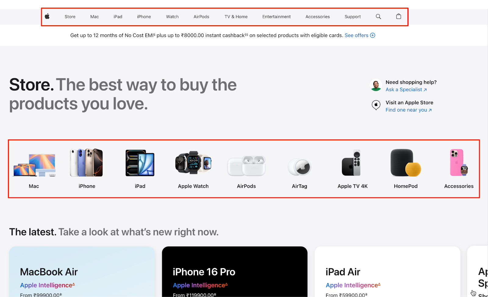
Cut the clutter in your menus and use logical categories. Zen Windows, for example, quadrupled its conversion rate from 0.75% to 2.95% after a redesign that made its site easier to navigate.
The key takeaway: if visitors struggle to find what they need, they won’t convert. Use descriptive labels (“Men’s Running Shoes” vs. “Products”) and keep the menu structure shallow. For inspiration, look at how Apple guides users with minimal, well-organized menus.
4. Enhance on-site search
People who use your search bar are usually ready to buy. Make sure the search function works well. That means showing relevant results, handling typos, and including useful filters. Autocomplete helps, too.
For example, if you run an apparel ecommerce store, make sure searching “red summer dress” actually shows relevant dresses. Add filtering options to help refine results. A benchmark study found that visitors who used search converted at 4.63%—almost twice the site average.

💡If implementing an advanced search functionality feels complex, you can bring in a CRO expert from MarketerHire to handle it. They’ll help you add smarter search tools and look at your search data to find missed opportunities.
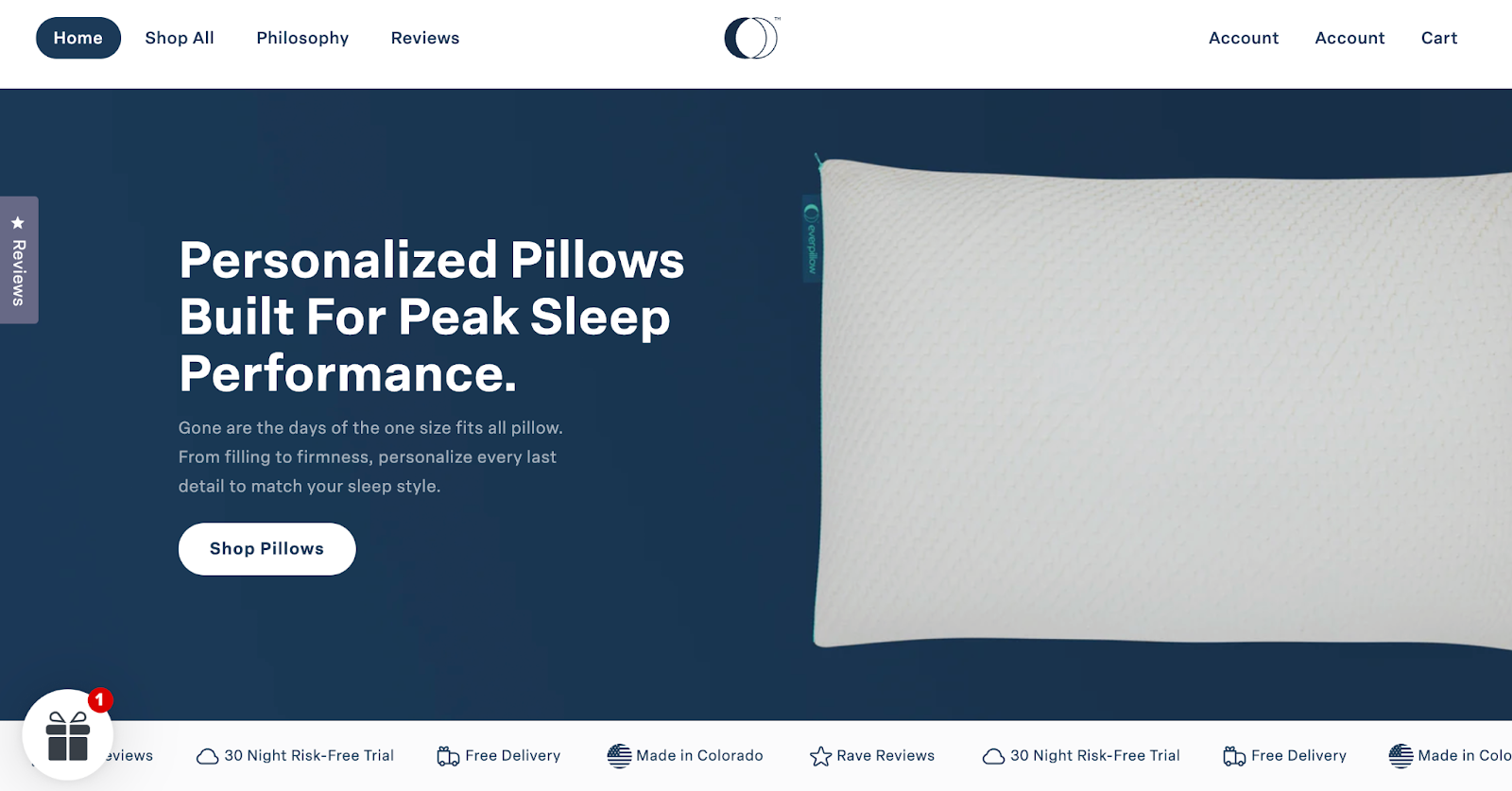
5. Highlight a clear value proposition
Within seconds, visitors should know why they should buy from you. Too many pages take a clinical “Here’s the product, I hope you buy it” approach instead of actually persuading. Cut the fluff on your homepage and product pages and communicate your unique selling points in bold, plain language.
Take Everpillow's landing page, for example. A sharp headline like “Personalized Pillows Built For Peak Sleep Performance” hooks you right in. It also trumpets up front additional benefits online shoppers get—free delivery and a 30-night risk-free trial.
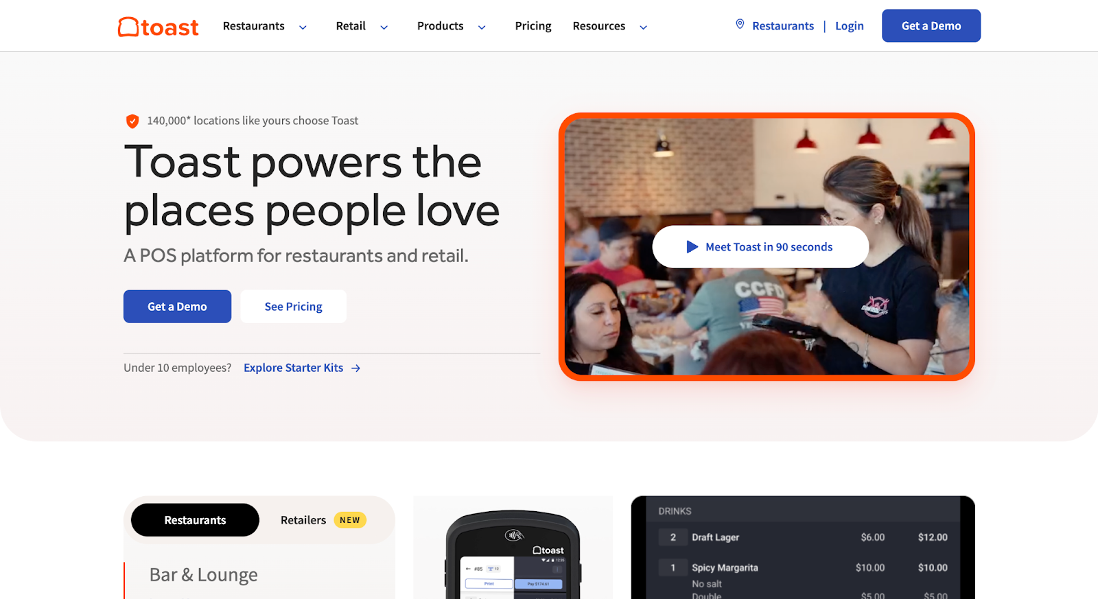
6. Use high-quality images (and video wisely)
Your product photos are doing one of two things: making people trust you, or making them leave.
Forget the idea that “more content = better.” One senior living brand swapped a fancy landing page video for a static photo and saw a 3.9% lift in conversions—over $100K in added revenue.
The lesson? Quality beats quantity. Use high-res images, showing the product in use, and keep load times fast. And if you must use video, make sure it adds context. Like this short explainer video showing how Toast works:
7. Write persuasive product descriptions
Your product pages should persuade the target audience, and to do that, they should sell the outcome.
Focus descriptions on benefits and outcomes, not just features. “10-cup capacity” tells the reader nothing. “Brew up to 10 cups of café-quality coffee that stays warm for two hours” tells them why they should care.
Use short sentences and bullet points for key features. Also, answer common questions (dimensions, materials, warranty) right on the page. Here's a great example from SoFlow:

If you’re not a writer, that’s fine—hire an expert who knows CRO or a copywriting agency. Test copy angles (luxury vs. value, toughness vs. comfort). And always, always lead with benefits.
8. Don’t hide your CTAs—or worse, make them vague
A good CTA isn’t polite. It’s obvious. Loud. Direct.
People are here to buy or leave. That means no “Learn More” buttons on product pages. Say what you mean: “Add to Cart,” “Buy Now,” “Get My Free Sample.” Use color contrast. Make it impossible to miss, especially on mobile.

As a case in point, the marketing team at Taskworld discovered via heatmaps that users weren’t clicking their primary signup button because it wasn’t obvious, and were even bypassing a required field. After they fixed those issues, conversions jumped 40%.
Microcopy matters too—“Ships Free” or “30-Day Returns” beneath a button adds just enough reassurance to close the loop.
9. Leverage social proof (reviews and ratings)
When people see that others like your product, they feel more confident buying it. So make it easy for existing customers to leave reviews—and show those reviews clearly on your product pages. Even a few negative reviews help build trust because they show you're being honest.
For example, boAt shows its star rating right above the product name: “★ 4.9 (66 Reviews).”

You can do something similar. Add real customer photos, highlight top reviews, or include lines like “Over 5,000 sold this month” or “5 bought in the last hour.” These small details reassure visitors they’re not the first to take the leap.
10. Build trust with badges and guarantees
Here, your goal is to eliminate the “is this site sketchy?” doubt from the user’s mind. Display security badges (SSL seals, payment icons) especially on checkout pages, and highlight any guarantees (money-back, authenticity, etc.).
Placement is key: for instance, putting a padlock icon near the credit card form can subliminally increase confidence. In fact, one site found that simply adding a security badge graphic on their homepage made visitors 2-3 times more likely to buy.
Beyond badges, make your policies clear and customer-friendly: e.g., Free Returns for 30 Days, or Guaranteed Authentic for luxury goods. Showcasing logos of trusted partners or antivirus scans (e.g., Norton Secured) can also help.
11. Simplify the checkout process
Checkout is where a lot of sales die. Nearly 70% of carts are abandoned, and a big reason is friction. Too many steps. Confusing layouts. And forced account creation.
What you need to do here is trim the fat. Remove unnecessary fields (do you really need a fax number?), and allow guest checkout—about a quarter of shoppers leave when they’re forced to create an account.

If your checkout has multiple steps, add a progress bar (“Step 2 of 3: Shipping Info”) so shoppers know what’s coming.
A one-page checkout can also help, letting users see everything—shipping, billing, and confirmation—in one place. Make sure form fields are clearly labeled, and flag errors in real time so people aren’t frustrated at the end.
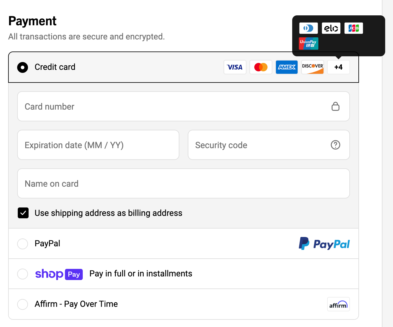
12. Offer multiple payment options
Some people only trust PayPal. Others prefer the speed of Apple Pay, Google Pay, or UPI. In markets like APAC,a lack of local payment options drives cart abandonment rates above 80%.
Don’t let checkout fail just because someone can’t pay the way they want. At a minimum, support all major credit cards, at least one wallet like PayPal, and consider adding a “buy now, pay later” option like Klarna or Afterpay if it makes sense for your audience.
Ridge, for instance, offers tons of payment options to its customers:
In some regions, offering cash on delivery might be worth testing.
💡Watch your payment step in analytics—if people are dropping off there, they may be looking for something you don’t offer.
13. Be transparent about prices and fees
When potential customers reach checkout, the price they see should be exactly what they expected. Almost half of shoppers abandon carts when fees, shipping, or taxes pop up at the last minute.
Fix this by being upfront. Show estimated shipping, taxes, or any added fees early—ideally on the product or cart page. Use messaging like “Free shipping over $50” or offer a shipping calculator before the final step.
Also, tell people when to expect their order. Vague or missing delivery estimates cause 1 in 5 shoppers to bounce. Clear messages like “Ships in 2–3 business days” or “Get it by June 8” build trust and reduce hesitation.
14. Implement live chat or chatbots
Sometimes, all it takes to close a sale is a quick answer to a sizing question or a shipping concern.
Live chat gives hesitant shoppers real-time conversational support right when they’re deciding whether to buy. If you can’t staff live agents around the clock, use a chatbot to handle common questions like “Where’s my order?” or “Do you ship internationally?” Eye-oo saw an impressive 25% increase in sales after incorporating one.
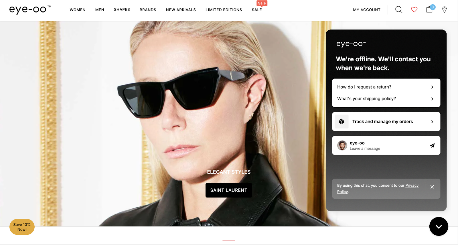
Trigger chat on key pages like product or cart, and keep it helpful—not pushy.
15. Use exit-intent offers to save sales
When someone’s about to leave your site, exit-intent popups can be your last chance to save the sale.
If a user has items in their cart and starts to leave, show an offer like “Wait—get 10% off if you complete your purchase now.” You can also use exit popups to collect emails: “Join our VIP list for a 15% welcome coupon.” Even if they don’t buy today, you can follow up later.

The key is to make the offer relevant and not overdo it. Tools like OptinMonster or Privy make setup easy—or a MarketerHire specialist can help you customize and test what works best.
Read More: How to Predict and Measure SEO ROI
16. Personalize recommendations and upsells
You’ve seen it on Amazon: “Customers who bought this item also bought…” That kind of personalized suggestion works because it feels helpful, not pushy. You can show related products based on browsing behavior or suggest complementary items right before checkout (like offering a 20% discount on a matching phone case).

The key is relevance. Don’t show random “featured” products—show things that actually make sense together. Yes, it takes some setup—like integrating a recommendation engine or defining logic rules—but it’s worth it.
17. Use incentives strategically (free shipping, discounts, loyalty)
The right incentive, shown at the right moment, can get you an instant sale. Use data to find where customers drop off, and test targeted offers that move them forward.
Free shipping is the classic example. Set a threshold like “Free shipping on orders over $50,” and many shoppers will add more just to qualify. In fact, 80% of shoppers say they’re willing to do that, and many retailers report a jump in average order value.

But you don’t always have to offer discounts. Framing offers as “get more value” often works better. Think: “Buy 2, get 1 free” or “Free gift with your first order.” Loyalty programs also help keep customers coming back by turning purchases into rewards.
18. Address customer objections early (FAQs and Info)
Add a simple FAQ to your product pages. Cover the basics: size, fit, materials, compatibility, returns, and anything else customers are likely to wonder about. If you sell tech, mention warranty and support. If you sell clothing, talk about how returns work for wrong sizes.
You can also use real customer Q&As—just moderate them to keep things useful. It shows buyers they’re not the only ones with questions, and your answers build confidence.
💡Look through your customer support messages or chat logs—if people keep asking the same thing, that info probably belongs on the page.
19. Continuously A/B test and iterate
To improve ecommerce conversion rates, you need to regularly hypothesize, test, and learn. In practice, this means running regular A/B tests on key pages and elements: page layouts, button colors, headlines, product descriptions—whatever could impact behavior. You might test something as small as the color of a CTA button or as big as a complete homepage redesign. The payoff can be huge, and the results aren’t always what you'd expect.

More than 70% of companies are running two or more A/B tests monthly. If you’re not testing, you’re guessing—and probably falling behind. Tools like Google Analytics, VWO, or built-in platform features can help. Start with your most visited pages or biggest drop-off points. And let your tests run long enough to gather solid data.
20. Find and squash technical bugs and friction points quickly
Basic site QA is just as critical to conversion optimization as A/B tests. Broken links, error pages, slow API calls, or forms that don’t submit—these are “conversion blockers” in the literal sense.
Monitor your site for errors: for example, if the “Place Order” button intermittently doesn’t work, you could be losing orders until you fix it. Use tools (or plugins) to get alerts on 404 errors or JavaScript console errors that users might encounter. Also, pay attention to browser compatibility and mobile vs. desktop behavior; maybe everything works on Chrome, but Safari users encounter a payment error.
Make it a habit to check your site after every update. Even better, have someone on your team (or a technical CRO expert) run regular audits.
Read More: 6 Best Growth Hacking Agencies in 2025
How to spot what’s hurting conversions
1. Check the funnel in analytics
Start with your analytics tool (like GA4) to find the biggest drop-off points, like users who add to cart but never start checkout. Set up funnel paths to see where people exit. If 60% drop off at the cart, you may need to simplify that step or make the next action clearer.
2. Watch real user behavior
Tools like Hotjar or FullStory let you see what users are doing—where they click, scroll, or get confused. Heatmaps show if people miss your CTA or never scroll to important info. Session replays can reveal hidden problems, like buttons that don’t work or unclear forms.
3. Ask users directly
Run user tests with real people walking through a task on your site. You’ll hear where they hesitate or get lost. Add on-site surveys asking why someone didn’t buy, or what nearly stopped them. Support chat logs are also useful—if customers keep asking how returns work, that info probably needs to be easier to find.
Key ecommerce CRO metrics to track
- Conversion Rate: How many site visitors actually make a purchase? It tells you how well your site turns traffic into customers. Even a small lift can mean more revenue.
- Cart Abandonment Rate: How many people add items to their cart but don’t finish buying? A high rate often means something in your checkout process is confusing or turning people away.
- Bounce Rate: How many visitors leave after viewing just one page? If people bounce from product or landing pages, they’re probably not finding what they expected—or your page isn’t engaging enough.
- Average Order Value (AOV): How much people spend per order, on average? If it’s low, consider using upsells, bundles, or free shipping thresholds to encourage bigger purchases.
- Revenue per Visitor (RPV): How much money do you earn from each person who visits your site? Use it to measure overall site performance, because it combines how many people buy and how much they spend.
Need help with ecommerce CRO? Hire a MarketerHire expert
Effective CRO is a mix of UX strategy, behavioral psychology, technical testing, and sharp copy. Most ecommerce teams don’t have all those skills in-house, and hiring full-time for each one? Expensive and slow.
At MarketerHire, we match you with proven CRO specialists who’ve already optimized ecommerce sites like yours—whether you’re focused on increasing checkout rates or fixing funnel drop-off. You’ll get fast access to freelance experts who can audit, test, and improve your site without dragging through a long hiring process. Hire top CRO specialists today.
